A logo, a website and printed pieces built to work together. Squeegie Studios carried The Ice Shanty’s identity across flyers, postcards and business cards through one creative team.
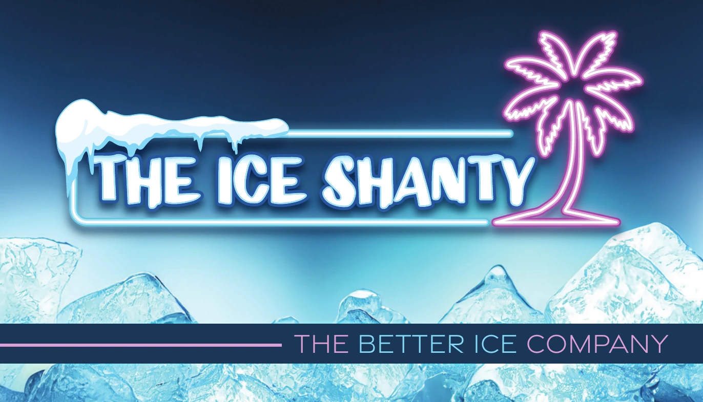
An original logo built around ice lettering and a neon palm.
The website
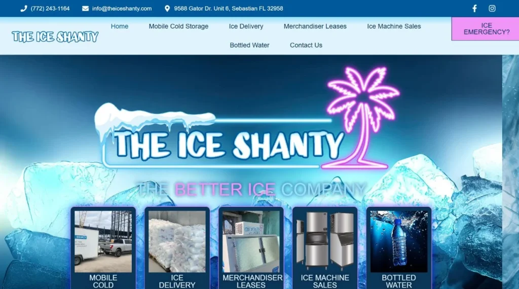
A service-focused site with local-search content and custom hover animation.
The printed pieces
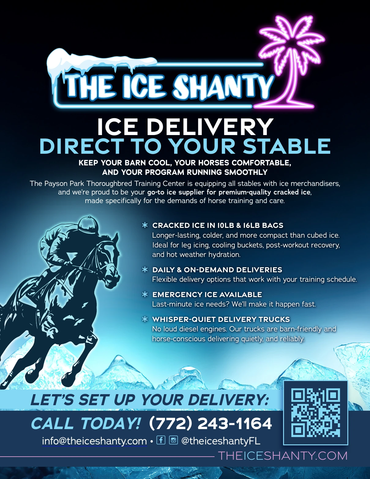
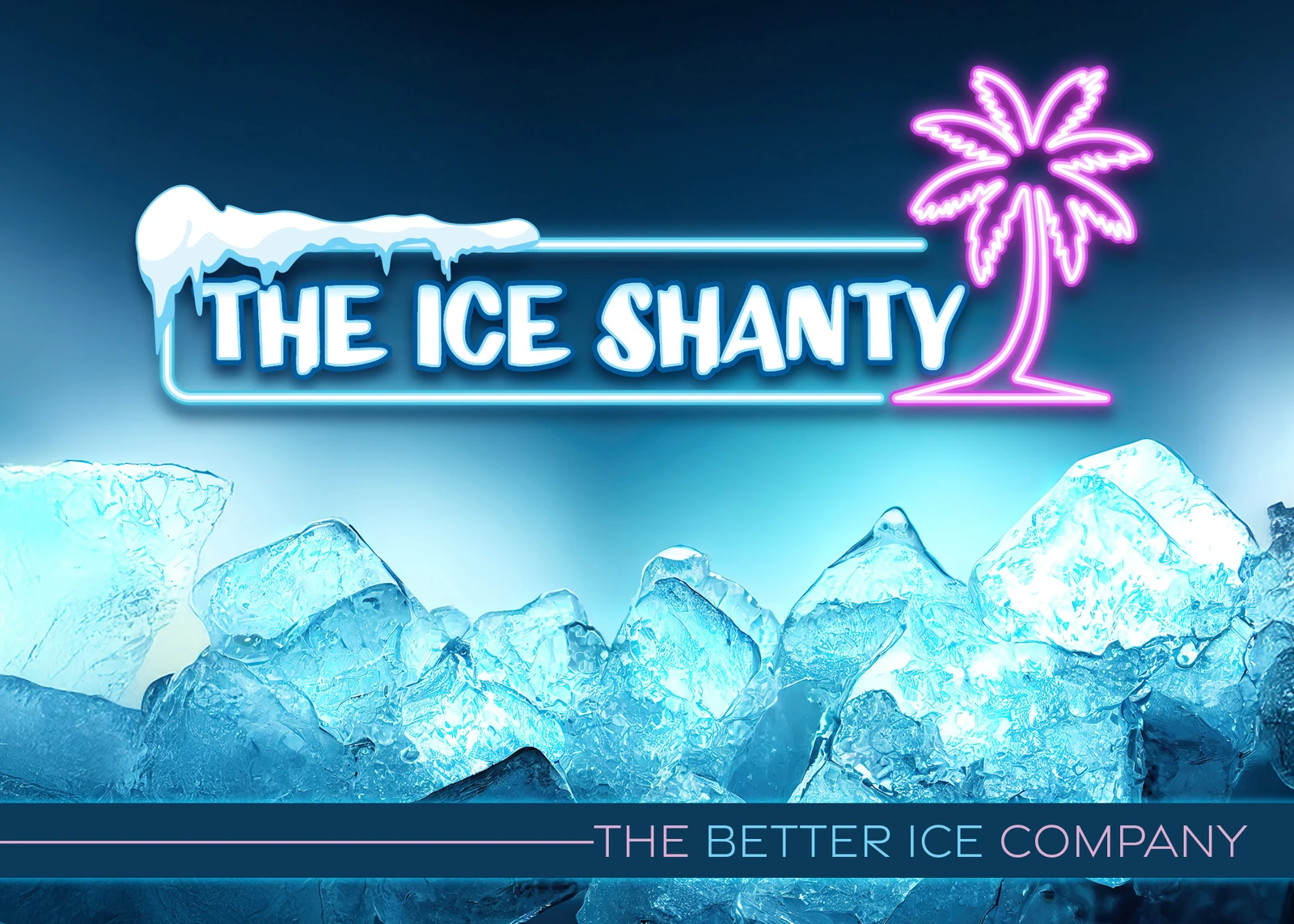
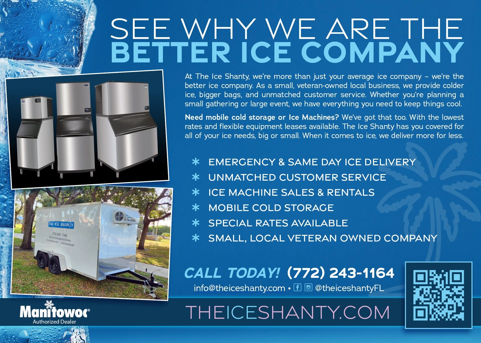
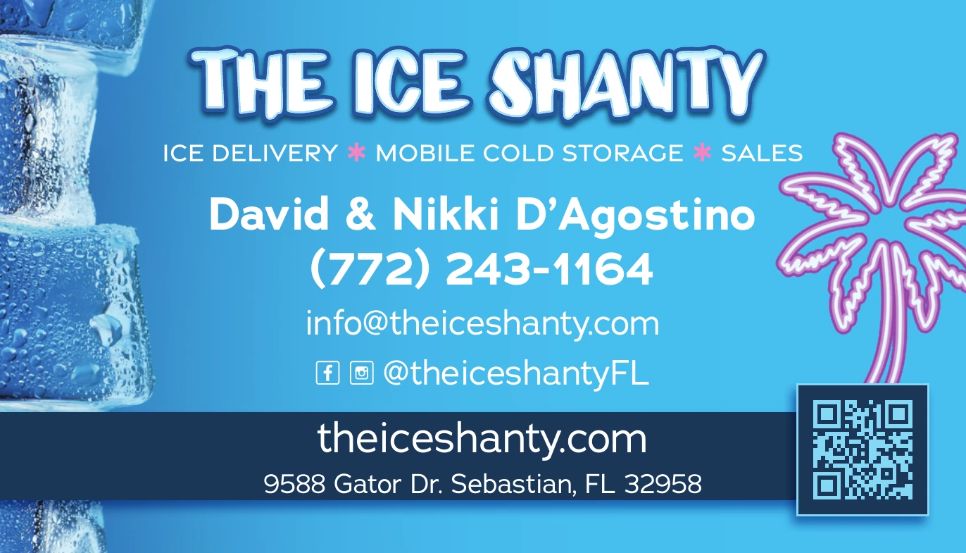
Flyers, postcards and business cards that carry the same visual identity.
Homepage of the live Ice Shanty website.
The brand online
The website makes The Ice Shanty’s services easy to explore, from ice delivery to mobile cold storage and equipment. The blue-and-pink identity carries through the page, with custom hover effects adding movement.
We built service content for regional search while keeping contact options close at hand.
Different formats, different jobs, one identity. The flyer speaks directly to thoroughbred training centers; the two-sided postcard introduces the company’s broader services. Select any piece to view it larger.
Contact information and a QR code complete the reverse.
Bring your next project together
Need a logo, website and printed materials that feel like one brand? Work directly with our Sebastian studio for a single piece or a wider project, locally or nationwide.